

[PROJECT]
Cristian Donoso Blasco
C. F. Fuenlabrada | 50th Anniversary
[PROJECT]
Cristian Donoso Blasco
C. F. Fuenlabrada | 50th Anniversary
[PROJECT]
Cristian Donoso Blasco
C. F. Fuenlabrada | 50th Anniversary
C. F. Fuenlabrada | 50th Anniversary
[PROJECT]
Cristian Donoso Blasco
[PROJECT]
Cristian Donoso Blasco
C. F. Fuenlabrada | 50th Anniversary
[PROJECT]
Cristian Donoso Blasco
C. F. Fuenlabrada | 50th Anniversary
ROLE
Graphic Designer
ROLE
Graphic Designer
ROLE
Graphic Designer

LOCATION
Fuenlabrada, Madrid
LOCATION
Fuenlabrada, Madrid
LOCATION
Fuenlabrada, Madrid

June 2025 – June 2026
June 2025 – June 2026
June 2025 – June 2026
PROJECT DURATION
PROJECT DURATION
PROJECT DURATION

Crest Design
Graphic System
Sports Design
Social Media Design
Crest Design
Graphic System
Sports Design
Social Media Design
Crest Design
Graphic System
Sports Design
Social Media Design
SERVICES
SERVICES
SERVICES

COMPANY
CF Fuenlabrada SAD
COMPANY
CF Fuenlabrada SAD
COMPANY
CF Fuenlabrada SAD

[ABOUT]
[ABOUT]
[ABOUT]
To commemorate C.F. Fuenlabrada’s 50th anniversary, I designed the season’s official visual identity, including a commemorative crest and a graphic system implemented across digital platforms, matchday communications and club materials, connecting the club’s heritage with a contemporary visual language while paying tribute to its history.
To commemorate C.F. Fuenlabrada’s 50th anniversary, I designed the season’s official visual identity, including a commemorative crest and a graphic system implemented across digital platforms, matchday communications and club materials, connecting the club’s heritage with a contemporary visual language while paying tribute to its history.
To commemorate C.F. Fuenlabrada’s 50th anniversary, I designed the season’s official visual identity, including a commemorative crest and a graphic system implemented across digital platforms, matchday communications and club materials, connecting the club’s heritage with a contemporary visual language while paying tribute to its history.
ROLE
Diseñador Gráfico
UBICACIÓN
Fuenlabrada, Madrid
DURACIÓN DEL PROYECTO
Junio 2025 – Junio 2026
SERVICIOS
Diseño de Escudo
Sistema Gráfico
Diseño Deportivo
Social Media Design
EMPRESA
CF Fuenlabrada SAD
[SOBRE]
Para conmemorar el 50 aniversario del C.F. Fuenlabrada, diseñé la identidad visual oficial de la temporada, incluyendo un escudo conmemorativo y un sistema gráfico implementado en plataformas digitales, comunicaciones de partido y materiales del club, conectando su historia con una imagen contemporánea y reconocible haciendo honor a su pasado e historia.


Home
KIT 25-26
The kit brings the principles of the 50th anniversary identity into the sporting environment.
The gold accents emphasize its commemorative character, while the composition respects the club’s identity and introduces a more contemporary and recognizable visual language.
The result is a shirt designed to represent the anniversary both on and off the pitch.
Home
KIT 25-26
The kit brings the principles of the 50th anniversary identity into the sporting environment.
The gold accents emphasize its commemorative character, while the composition respects the club’s identity and introduces a more contemporary and recognizable visual language.
The result is a shirt designed to represent the anniversary both on and off the pitch.
Home
KIT 25-26
The kit brings the principles of the 50th anniversary identity into the sporting environment.
The gold accents emphasize its commemorative character, while the composition respects the club’s identity and introduces a more contemporary and recognizable visual language.
The result is a shirt designed to represent the anniversary both on and off the pitch.
Home
KIT 25-26
The kit brings the principles of the 50th anniversary identity into the sporting environment.
The gold accents emphasize its commemorative character, while the composition respects the club’s identity and introduces a more contemporary and recognizable visual language.
The result is a shirt designed to represent the anniversary both on and off the pitch.
Home
KIT 25-26
The kit brings the principles of the 50th anniversary identity into the sporting environment.
The gold accents emphasize its commemorative character, while the composition respects the club’s identity and introduces a more contemporary and recognizable visual language.
The result is a shirt designed to represent the anniversary both on and off the pitch.
Home
KIT 25-26
The kit brings the principles of the 50th anniversary identity into the sporting environment.
The gold accents emphasize its commemorative character, while the composition respects the club’s identity and introduces a more contemporary and recognizable visual language.
The result is a shirt designed to represent the anniversary both on and off the pitch.

Club de Fútbol Fuenlabrada was founded in 1975, following the merger of Agrupación Deportiva Fuenlabrada and Club Deportivo San Esteban.
Throughout its 50-year history, the club has experienced several unforgettable moments, including its historic promotion to Spain’s Second Division in 2019, three seasons in the Second Division, and its memorable Copa del Rey tie against Real Madrid, which culminated in a draw at the Santiago Bernabéu in 2017 — milestones that became part of the club’s history and its supporters’ collective memory.
Context & Impact
The project was developed in collaboration with the club’s management, with the aim of strengthening the sense of belonging within the club’s community and creating a commemorative visual identity for CF Fuenlabrada that reflected its history, values and vision for the future.
Created within a particularly challenging context, following the club’s relegation to Segunda RFEF in the 2024/25 season, the 50th anniversary identity was conceived as a visual expression of unity, pride and renewed optimism for both the supporters and the institution.
Designer: Cristian Donoso Blasco
© Photos: CF Fuenlabrada
50th Anniversary Identity
Club de Fútbol Fuenlabrada was founded in 1975, following the merger of Agrupación Deportiva Fuenlabrada and Club Deportivo San Esteban.
Throughout its 50-year history, the club has experienced several unforgettable moments, including its historic promotion to Spain’s Second Division in 2019, three seasons in the Second Division, and its memorable Copa del Rey tie against Real Madrid, which culminated in a draw at the Santiago Bernabéu in 2017 — milestones that became part of the club’s history and its supporters’ collective memory.
Context & Impact
The project was developed in collaboration with the club’s management, with the aim of strengthening the sense of belonging within the club’s community and creating a commemorative visual identity for CF Fuenlabrada that reflected its history, values and vision for the future.
Created within a particularly challenging context, following the club’s relegation to Segunda RFEF in the 2024/25 season, the 50th anniversary identity was conceived as a visual expression of unity, pride and renewed optimism for both the supporters and the institution.
Designer: Cristian Donoso Blasco
© Photos: CF Fuenlabrada
50th Anniversary Identity
Club de Fútbol Fuenlabrada was founded in 1975, following the merger of Agrupación Deportiva Fuenlabrada and Club Deportivo San Esteban.
Throughout its 50-year history, the club has experienced several unforgettable moments, including its historic promotion to Spain’s Second Division in 2019, three seasons in the Second Division, and its memorable Copa del Rey tie against Real Madrid, which culminated in a draw at the Santiago Bernabéu in 2017 — milestones that became part of the club’s history and its supporters’ collective memory.
Context & Impact
The project was developed in collaboration with the club’s management, with the aim of strengthening the sense of belonging within the club’s community and creating a commemorative visual identity for CF Fuenlabrada that reflected its history, values and vision for the future.
Created within a particularly challenging context, following the club’s relegation to Segunda RFEF in the 2024/25 season, the 50th anniversary identity was conceived as a visual expression of unity, pride and renewed optimism for both the supporters and the institution.
Designer: Cristian Donoso Blasco
© Photos: CF Fuenlabrada
50th Anniversary Identity
Club de Fútbol Fuenlabrada was founded in 1975, following the merger of Agrupación Deportiva Fuenlabrada and Club Deportivo San Esteban.
Throughout its 50-year history, the club has experienced several unforgettable moments, including its historic promotion to Spain’s Second Division in 2019, three seasons in the Second Division, and its memorable Copa del Rey tie against Real Madrid, which culminated in a draw at the Santiago Bernabéu in 2017 — milestones that became part of the club’s history and its supporters’ collective memory.
Context & Impact
The project was developed in collaboration with the club’s management, with the aim of strengthening the sense of belonging within the club’s community and creating a commemorative visual identity for CF Fuenlabrada that reflected its history, values and vision for the future.
Created within a particularly challenging context, following the club’s relegation to Segunda RFEF in the 2024/25 season, the 50th anniversary identity was conceived as a visual expression of unity, pride and renewed optimism for both the supporters and the institution.
Designer: Cristian Donoso Blasco
© Photos: CF Fuenlabrada
50th Anniversary Identity
Club de Fútbol Fuenlabrada was founded in 1975, following the merger of Agrupación Deportiva Fuenlabrada and Club Deportivo San Esteban.
Throughout its 50-year history, the club has experienced several unforgettable moments, including its historic promotion to Spain’s Second Division in 2019, three seasons in the Second Division, and its memorable Copa del Rey tie against Real Madrid, which culminated in a draw at the Santiago Bernabéu in 2017 — milestones that became part of the club’s history and its supporters’ collective memory.
Context & Impact
The project was developed in collaboration with the club’s management, with the aim of strengthening the sense of belonging within the club’s community and creating a commemorative visual identity for CF Fuenlabrada that reflected its history, values and vision for the future.
Created within a particularly challenging context, following the club’s relegation to Segunda RFEF in the 2024/25 season, the 50th anniversary identity was conceived as a visual expression of unity, pride and renewed optimism for both the supporters and the institution.
Designer: Cristian Donoso Blasco
© Photos: CF Fuenlabrada
50th Anniversary Identity
Club de Fútbol Fuenlabrada was founded in 1975, following the merger of Agrupación Deportiva Fuenlabrada and Club Deportivo San Esteban.
Throughout its 50-year history, the club has experienced several unforgettable moments, including its historic promotion to Spain’s Second Division in 2019, three seasons in the Second Division, and its memorable Copa del Rey tie against Real Madrid, which culminated in a draw at the Santiago Bernabéu in 2017 — milestones that became part of the club’s history and its supporters’ collective memory.
Context & Impact
The project was developed in collaboration with the club’s management, with the aim of strengthening the sense of belonging within the club’s community and creating a commemorative visual identity for CF Fuenlabrada that reflected its history, values and vision for the future.
Created within a particularly challenging context, following the club’s relegation to Segunda RFEF in the 2024/25 season, the 50th anniversary identity was conceived as a visual expression of unity, pride and renewed optimism for both the supporters and the institution.
Designer: Cristian Donoso Blasco
© Photos: CF Fuenlabrada
50th Anniversary Identity


The 50th anniversary identity is built around the most recognizable elements of CF Fuenlabrada. Gold was chosen as the primary color to emphasize the commemorative nature of the anniversary and convey the historical significance of the occasion.
The 50th anniversary identity is built around the most recognizable elements of CF Fuenlabrada. Gold was chosen as the primary color to emphasize the commemorative nature of the anniversary and convey the historical significance of the occasion.
The 50th anniversary identity is built around the most recognizable elements of CF Fuenlabrada. Gold was chosen as the primary color to emphasize the commemorative nature of the anniversary and convey the historical significance of the occasion.
Crest Construction
Crest Construction
Crest Construction
Crest Construction
Design Decisions
Design Decisions
Design Decisions
Design Decisions
Color
Color
Color
Color
The emblem’s shape is based on a simplified reinterpretation of the scroll featured in the club’s official crest, transforming it into a cleaner, more contemporary structure while preserving its original meaning.
The emblem’s shape is based on a simplified reinterpretation of the scroll featured in the club’s official crest, transforming it into a cleaner, more contemporary structure while preserving its original meaning.
The emblem’s shape is based on a simplified reinterpretation of the scroll featured in the club’s official crest, transforming it into a cleaner, more contemporary structure while preserving its original meaning.
Shape
Shape
Shape
Shape
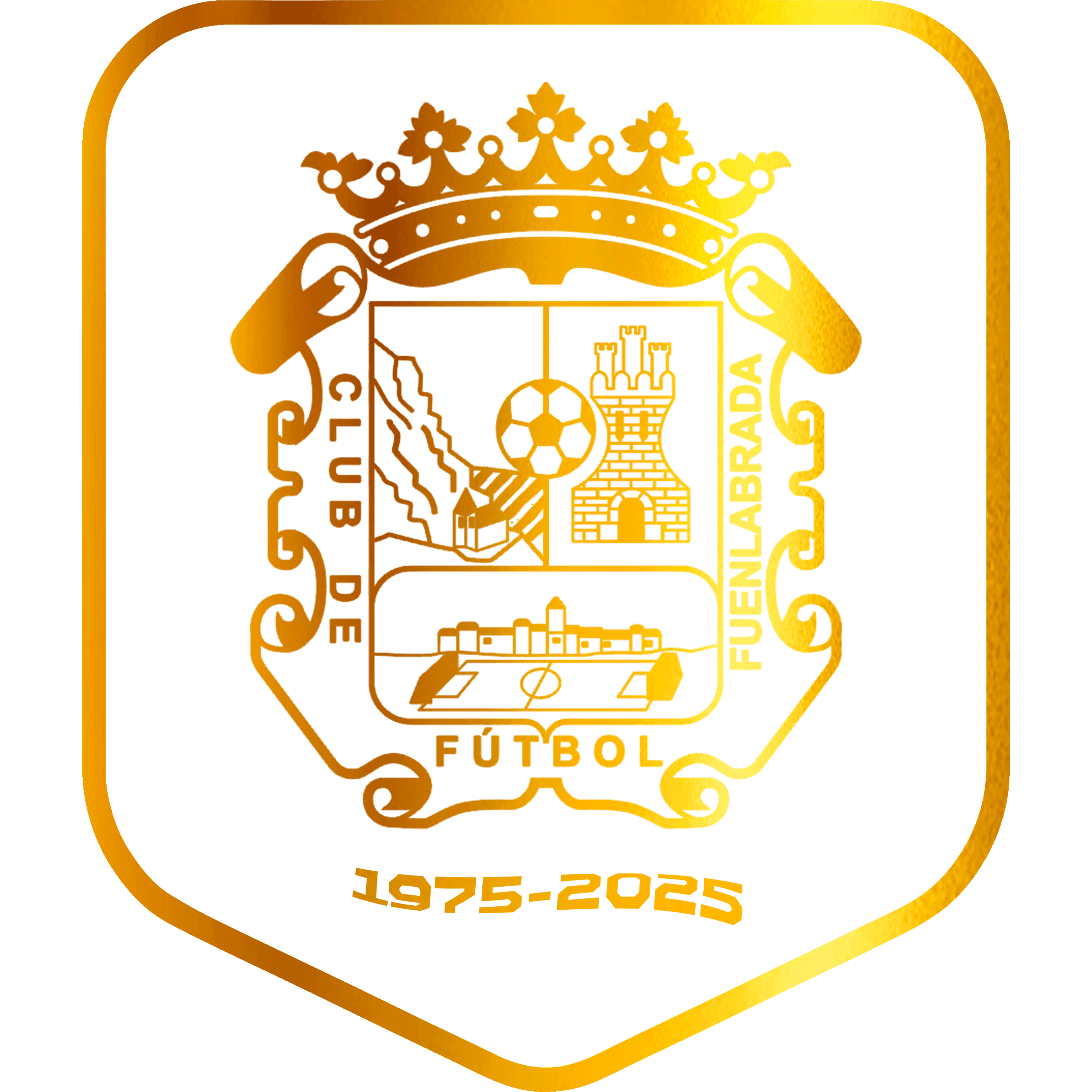
The historic crest is incorporated into this structure in a monochrome version, accompanied by the “1975–2025” date set in the club’s corporate typeface, TT Octosquare, reinforcing the visual consistency of the identity.
The historic crest is incorporated into this structure in a monochrome version, accompanied by the “1975–2025” date set in the club’s corporate typeface, TT Octosquare, reinforcing the visual consistency of the identity.
The historic crest is incorporated into this structure in a monochrome version, accompanied by the “1975–2025” date set in the club’s corporate typeface, TT Octosquare, reinforcing the visual consistency of the identity.
Typography
Typography
Typography
Typography
The symbol was designed to give maximum prominence to the crest silhouette, establishing it as the identity’s main recognizable element while serving as a visual tribute to the club’s legacy and history.
The symbol was designed to give maximum prominence to the crest silhouette, establishing it as the identity’s main recognizable element while serving as a visual tribute to the club’s legacy and history.
The symbol was designed to give maximum prominence to the crest silhouette, establishing it as the identity’s main recognizable element while serving as a visual tribute to the club’s legacy and history.
Objective
Objective
Objective
Objective



The captain’s armband was designed as a symbol of leadership and belonging, placing the 50th anniversary commemorative crest at the heart of the design. The blue band and gold details reinforce CF Fuenlabrada’s visual identity, while the colors on each side reference the club’s roots in the Community of Madrid and Spain.
Captain’s
ARMBAND 25-26

The captain’s armband was designed as a symbol of leadership and belonging, placing the 50th anniversary commemorative crest at the heart of the design. The blue band and gold details reinforce CF Fuenlabrada’s visual identity, while the colors on each side reference the club’s roots in the Community of Madrid and Spain.
Captain’s
ARMBAND 25-26
The captain’s armband was designed as a symbol of leadership and belonging, placing the 50th anniversary commemorative crest at the heart of the design. The blue band and gold details reinforce CF Fuenlabrada’s visual identity, while the colors on each side reference the club’s roots in the Community of Madrid and Spain.
Captain’s
ARMBAND 25-26
The captain’s armband was designed as a symbol of leadership and belonging, placing the 50th anniversary commemorative crest at the heart of the design. The blue band and gold details reinforce CF Fuenlabrada’s visual identity, while the colors on each side reference the club’s roots in the Community of Madrid and Spain.
Captain’s
ARMBAND 25-26
The captain’s armband was designed as a symbol of leadership and belonging, placing the 50th anniversary commemorative crest at the heart of the design. The blue band and gold details reinforce CF Fuenlabrada’s visual identity, while the colors on each side reference the club’s roots in the Community of Madrid and Spain.
Captain’s
ARMBAND 25-26
The captain’s armband was designed as a symbol of leadership and belonging, placing the 50th anniversary commemorative crest at the heart of the design. The blue band and gold details reinforce CF Fuenlabrada’s visual identity, while the colors on each side reference the club’s roots in the Community of Madrid and Spain.
Captain’s
ARMBAND 25-26

The season ticket design is built around the repetition of the vectorized crest silhouette, creating visual depth while strengthening the recognition and consistency of the club’s identity.
Season
TICKETS 25-26
The season ticket design is built around the repetition of the vectorized crest silhouette, creating visual depth while strengthening the recognition and consistency of the club’s identity.
Season
TICKETS 25-26
The season ticket design is built around the repetition of the vectorized crest silhouette, creating visual depth while strengthening the recognition and consistency of the club’s identity.
Season
TICKETS 25-26
The season ticket design is built around the repetition of the vectorized crest silhouette, creating visual depth while strengthening the recognition and consistency of the club’s identity.
Season
TICKETS 25-26
The season ticket design is built around the repetition of the vectorized crest silhouette, creating visual depth while strengthening the recognition and consistency of the club’s identity.
Season
TICKETS 25-26
The season ticket design is built around the repetition of the vectorized crest silhouette, creating visual depth while strengthening the recognition and consistency of the club’s identity.
Season
TICKETS 25-26

The kit typography was redesigned to give the shirt a distinctive identity of its own.
The addition of pointed terminals to the numerals adds greater personality and character, turning them into a prominent visual element within the overall design.
Typography
KIT 25-26
Kit Example
Kit Numbers
Kit Letters
The kit typography was redesigned to give the shirt a distinctive identity of its own.
The addition of pointed terminals to the numerals adds greater personality and character, turning them into a prominent visual element within the overall design.
Typography
KIT 25-26
Kit Example
Kit Numbers
Kit Letters
The kit typography was redesigned to give the shirt a distinctive identity of its own.
The addition of pointed terminals to the numerals adds greater personality and character, turning them into a prominent visual element within the overall design.
Typography
KIT 25-26
Kit Example
Kit Numbers
Kit Letters
The kit typography was redesigned to give the shirt a distinctive identity of its own.
The addition of pointed terminals to the numerals adds greater personality and character, turning them into a prominent visual element within the overall design.
Typography
KIT 25-26
Kit Example
Kit Numbers
Kit Letters
The kit typography was redesigned to give the shirt a distinctive identity of its own.
The addition of pointed terminals to the numerals adds greater personality and character, turning them into a prominent visual element within the overall design.
Typography
KIT 25-26
Kit Example
Kit Numbers
Kit Letters


Visual
Language
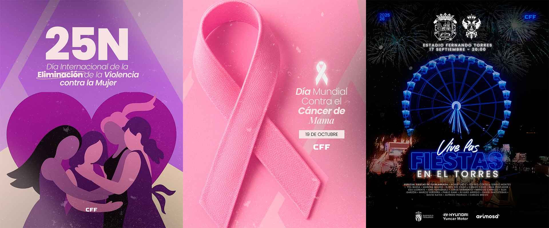
The 50th anniversary commemorative crest is supported by a visual system specifically developed for its application across social media.
The system combines a classic and elegant style with a contemporary approach, expressing CF Fuenlabrada’s identity and history through a cohesive visual language.
The aim is not only to celebrate the club’s anniversary, but also to consistently represent its past, present and vision for the future.
SOCIAL
MEDIA.
Social Typography
Visual
Language
The 50th anniversary commemorative crest is supported by a visual system specifically developed for its application across social media.
The system combines a classic and elegant style with a contemporary approach, expressing CF Fuenlabrada’s identity and history through a cohesive visual language.
The aim is not only to celebrate the club’s anniversary, but also to consistently represent its past, present and vision for the future.
SOCIAL
MEDIA.
Social Typography
Visual
Language
The 50th anniversary commemorative crest is supported by a visual system specifically developed for its application across social media.
The system combines a classic and elegant style with a contemporary approach, expressing CF Fuenlabrada’s identity and history through a cohesive visual language.
The aim is not only to celebrate the club’s anniversary, but also to consistently represent its past, present and vision for the future.
SOCIAL
MEDIA.
Social Typography
Visual
Language
The 50th anniversary commemorative crest is supported by a visual system specifically developed for its application across social media.
The system combines a classic and elegant style with a contemporary approach, expressing CF Fuenlabrada’s identity and history through a cohesive visual language.
The aim is not only to celebrate the club’s anniversary, but also to consistently represent its past, present and vision for the future.
SOCIAL
MEDIA.
Social Typography
Visual
Language
The 50th anniversary commemorative crest is supported by a visual system specifically developed for its application across social media.
The system combines a classic and elegant style with a contemporary approach, expressing CF Fuenlabrada’s identity and history through a cohesive visual language.
The aim is not only to celebrate the club’s anniversary, but also to consistently represent its past, present and vision for the future.
SOCIAL
MEDIA.
Social Typography
Visual
Language
The 50th anniversary commemorative crest is supported by a visual system specifically developed for its application across social media.
The system combines a classic and elegant style with a contemporary approach, expressing CF Fuenlabrada’s identity and history through a cohesive visual language.
The aim is not only to celebrate the club’s anniversary, but also to consistently represent its past, present and vision for the future.
SOCIAL
MEDIA.
Social Typography




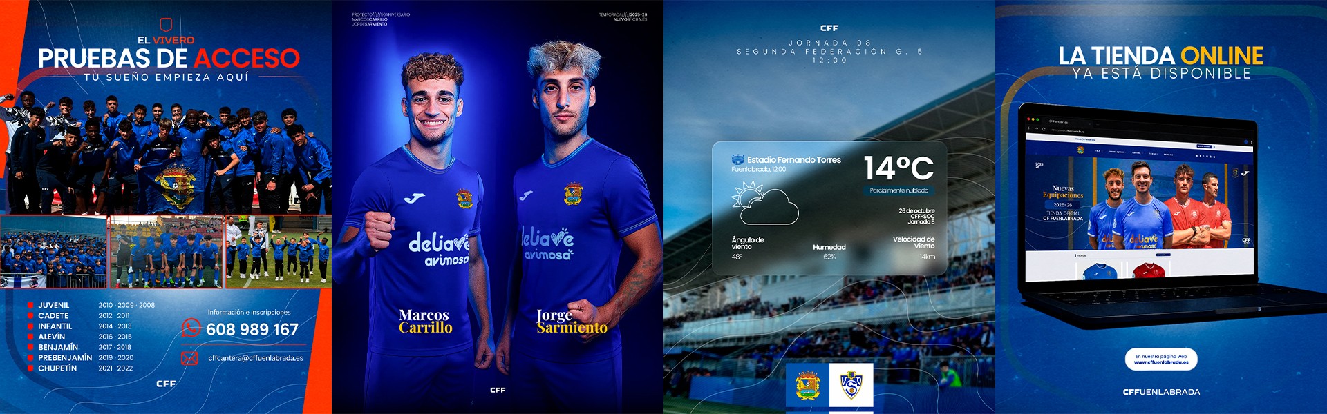


New Signing Announcements
The graphics created to present new signings were conceived as a tribute to CF Fuenlabrada’s history for the club’s 50th anniversary. The composition brings back the kits worn during the 1980s and 1990s, reinterpreting them to evoke the club’s historic identity and give each announcement a more emotional character.
Each player is presented wearing the retro kit, accompanied by two black-and-white photographs with an analogue aesthetic, reinforcing the feeling of historical archive and legacy. La Aldehuela serves as the main setting, connecting past and present so that every new arrival feels like a new chapter in the club’s history, rather than simply another signing announcement.
New Signing Announcements
The graphics created to present new signings were conceived as a tribute to CF Fuenlabrada’s history for the club’s 50th anniversary. The composition brings back the kits worn during the 1980s and 1990s, reinterpreting them to evoke the club’s historic identity and give each announcement a more emotional character.
Each player is presented wearing the retro kit, accompanied by two black-and-white photographs with an analogue aesthetic, reinforcing the feeling of historical archive and legacy. La Aldehuela serves as the main setting, connecting past and present so that every new arrival feels like a new chapter in the club’s history, rather than simply another signing announcement.
New Signing Announcements
The graphics created to present new signings were conceived as a tribute to CF Fuenlabrada’s history for the club’s 50th anniversary. The composition brings back the kits worn during the 1980s and 1990s, reinterpreting them to evoke the club’s historic identity and give each announcement a more emotional character.
Each player is presented wearing the retro kit, accompanied by two black-and-white photographs with an analogue aesthetic, reinforcing the feeling of historical archive and legacy. La Aldehuela serves as the main setting, connecting past and present so that every new arrival feels like a new chapter in the club’s history, rather than simply another signing announcement.
New Signing Announcements
The graphics created to present new signings were conceived as a tribute to CF Fuenlabrada’s history for the club’s 50th anniversary. The composition brings back the kits worn during the 1980s and 1990s, reinterpreting them to evoke the club’s historic identity and give each announcement a more emotional character.
Each player is presented wearing the retro kit, accompanied by two black-and-white photographs with an analogue aesthetic, reinforcing the feeling of historical archive and legacy. La Aldehuela serves as the main setting, connecting past and present so that every new arrival feels like a new chapter in the club’s history, rather than simply another signing announcement.
New Signing Announcements
The graphics created to present new signings were conceived as a tribute to CF Fuenlabrada’s history for the club’s 50th anniversary. The composition brings back the kits worn during the 1980s and 1990s, reinterpreting them to evoke the club’s historic identity and give each announcement a more emotional character.
Each player is presented wearing the retro kit, accompanied by two black-and-white photographs with an analogue aesthetic, reinforcing the feeling of historical archive and legacy. La Aldehuela serves as the main setting, connecting past and present so that every new arrival feels like a new chapter in the club’s history, rather than simply another signing announcement.
New Signing Announcements
The graphics created to present new signings were conceived as a tribute to CF Fuenlabrada’s history for the club’s 50th anniversary. The composition brings back the kits worn during the 1980s and 1990s, reinterpreting them to evoke the club’s historic identity and give each announcement a more emotional character.
Each player is presented wearing the retro kit, accompanied by two black-and-white photographs with an analogue aesthetic, reinforcing the feeling of historical archive and legacy. La Aldehuela serves as the main setting, connecting past and present so that every new arrival feels like a new chapter in the club’s history, rather than simply another signing announcement.


La identidad del 50º aniversario se construye a partir de los elementos más representativos del CF Fuenlabrada. El dorado se adopta como color principal para enfatizar el carácter conmemorativo de la efeméride y transmitir la relevancia histórica del acontecimiento.
Construcción de escudo
Decisiones de diseño
Color
La forma del emblema nace de una reinterpretación simplificada del pergamino presente en el escudo oficial del Club, transformándolo en una estructura más limpia y contemporánea sin perder su significado original.
Forma
Sobre esta base se incorpora la insignia histórica en versión monocromática, acompañada de la fecha ‘1975–2025’ compuesta con la tipografía corporativa TT Octosquare, reforzando la coherencia visual de la identidad.
Tipografía
La construcción del símbolo busca otorgar el máximo protagonismo a la silueta del escudo, convirtiéndola en el principal elemento de reconocimiento y en un homenaje visual al legado y la historia de la entidad.
Objetivo


La identidad del 50º aniversario se construye a partir de los elementos más representativos del CF Fuenlabrada. El dorado se adopta como color principal para enfatizar el carácter conmemorativo de la efeméride y transmitir la relevancia histórica del acontecimiento.
Construcción de escudo
Decisiones de diseño
Color
La forma del emblema nace de una reinterpretación simplificada del pergamino presente en el escudo oficial del Club, transformándolo en una estructura más limpia y contemporánea sin perder su significado original.
Forma
Sobre esta base se incorpora la insignia histórica en versión monocromática, acompañada de la fecha ‘1975–2025’ compuesta con la tipografía corporativa TT Octosquare, reforzando la coherencia visual de la identidad.
Tipografía
La construcción del símbolo busca otorgar el máximo protagonismo a la silueta del escudo, convirtiéndola en el principal elemento de reconocimiento y en un homenaje visual al legado y la historia de la entidad.
Objetivo