

Pulse Now - App | Rebranding
Cristian Donoso Blasco
[PROJECT]
Pulse Now - App | Rebranding
[PROJECT]
Cristian Donoso Blasco
[PROJECT]
Cristian Donoso Blasco
Pulse Now - App | Rebranding
[PROJECT]
Cristian Donoso Blasco
Pulse Now - App | Rebranding
[PROJECT]
Cristian Donoso Blasco
Pulse Now - App | Rebranding
[PROJECT]
Cristian Donoso Blasco
Pulse Now - App | Rebranding
ROLE
Brand Designer
ROLE
Brand Designer
ROLE
Brand Designer

LOCATION
Portland, USA (Remote)
LOCATION
Portland, USA (Remote)
LOCATION
Portland, USA (Remote)

November 2024 – March 2025
November 2024 – March 2025
November 2024 – March 2025
PROJECT DURATION
PROJECT DURATION
PROJECT DURATION

Brand Strategy
Visual Identity
Logo Design
Graphic System
Art Direction
Brand Strategy
Visual Identity
Logo Design
Graphic System
Art Direction
Brand Strategy
Visual Identity
Logo Design
Graphic System
Art Direction
SERVICES
SERVICES
SERVICES

COMPANY
Pulse Now
COMPANY
Pulse Now
COMPANY
Pulse Now

[ABOUT]
[ABOUT]
[ABOUT]
Pulse is a social app focused on building genuine friendships through shared interests and real-life experiences. The project involved developing a new visual identity designed to convey approachability, modernity and differentiation within the highly competitive social and dating app market.
Pulse is a social app focused on building genuine friendships through shared interests and real-life experiences. The project involved developing a new visual identity designed to convey approachability, modernity and differentiation within the highly competitive social and dating app market.


Pulse is a social media app focused on meeting new people and building genuine friendships. The product connects users through shared interests, nearby plans and simple conversations, turning online discovery into real-life social experiences.
Designed for people who want to expand their circle in a natural way: discover communities, join plans, and meet friends without the pressure of “dating-first” platforms.
Pulse,
a social app for
real friendships.
Context.
Previous logo.
The previous logo was simple and neutral, but it didn’t express a clear idea behind Pulse. Its form felt quite typical, which made it harder to remember and less recognizable in crowded app stores and social feeds. It also didn’t provide a strong colour language to build a consistent identity across the product and marketing touchpoints. online discovery into real-life social experiences.
Not distinctive
enough to
stand out.
Brand Core
Pulse is a social media app focused on meeting new people and building genuine friendships. The product connects users through shared interests, nearby plans and simple conversations, turning online discovery into real-life social experiences.
Designed for people who want to expand their circle in a natural way: discover communities, join plans, and meet friends without the pressure of “dating-first” platforms.
Pulse,
a social app for
real friendships.
Context.
Previous logo.
The previous logo was simple and neutral, but it didn’t express a clear idea behind Pulse. Its form felt quite typical, which made it harder to remember and less recognizable in crowded app stores and social feeds. It also didn’t provide a strong colour language to build a consistent identity across the product and marketing touchpoints. online discovery into real-life social experiences.
Not distinctive
enough to
stand out.
Brand Core
Pulse is a social media app focused on meeting new people and building genuine friendships. The product connects users through shared interests, nearby plans and simple conversations, turning online discovery into real-life social experiences.
Designed for people who want to expand their circle in a natural way: discover communities, join plans, and meet friends without the pressure of “dating-first” platforms.
Pulse,
a social app for
real friendships.
Context.
Previous logo.
The previous logo was simple and neutral, but it didn’t express a clear idea behind Pulse. Its form felt quite typical, which made it harder to remember and less recognizable in crowded app stores and social feeds. It also didn’t provide a strong colour language to build a consistent identity across the product and marketing touchpoints. online discovery into real-life social experiences.
Not distinctive
enough to
stand out.
Brand Core
Pulse is a social media app focused on meeting new people and building genuine friendships. The product connects users through shared interests, nearby plans and simple conversations, turning online discovery into real-life social experiences.
Designed for people who want to expand their circle in a natural way: discover communities, join plans, and meet friends without the pressure of “dating-first” platforms.
Pulse,
a social app for
real friendships.
Context.
Previous logo.
The previous logo was simple and neutral, but it didn’t express a clear idea behind Pulse. Its form felt quite typical, which made it harder to remember and less recognizable in crowded app stores and social feeds. It also didn’t provide a strong colour language to build a consistent identity across the product and marketing touchpoints. online discovery into real-life social experiences.
Not distinctive
enough to
stand out.
Brand Core
Pulse is a social media app focused on meeting new people and building genuine friendships. The product connects users through shared interests, nearby plans and simple conversations, turning online discovery into real-life social experiences.
Designed for people who want to expand their circle in a natural way: discover communities, join plans, and meet friends without the pressure of “dating-first” platforms.
Pulse,
a social app for
real friendships.
Context.
Previous logo.
The previous logo was simple and neutral, but it didn’t express a clear idea behind Pulse. Its form felt quite typical, which made it harder to remember and less recognizable in crowded app stores and social feeds. It also didn’t provide a strong colour language to build a consistent identity across the product and marketing touchpoints. online discovery into real-life social experiences.
Not distinctive
enough to
stand out.
Brand Core
Pulse is a social media app focused on meeting new people and building genuine friendships. The product connects users through shared interests, nearby plans and simple conversations, turning online discovery into real-life social experiences.
Designed for people who want to expand their circle in a natural way: discover communities, join plans, and meet friends without the pressure of “dating-first” platforms.
Pulse,
a social app for
real friendships.
Context.
Previous logo.
The previous logo was simple and neutral, but it didn’t express a clear idea behind Pulse. Its form felt quite typical, which made it harder to remember and less recognizable in crowded app stores and social feeds. It also didn’t provide a strong colour language to build a consistent identity across the product and marketing touchpoints. online discovery into real-life social experiences.
Not distinctive
enough to
stand out.
Brand Core

The previous logo lacked distinctiveness. It didn’t communicate what Pulse stands for at first glance. The rebrand goal was to create a friendly, modern identity that instantly signals “meet friends nearby”, with a visual system strong enough to live across the app, social content and campaigns.
From neutral
to memorable.
Problem solved.
Rebrand Strategy.
The rebrand was built around clear strategic choices to make Pulse instantly recognizable and consistently usable across product and marketing. We defined a visual territory that feels friendly and modern, established a friendship tone, and created a scalable system with strong hierarchy to work from app UI to campaigns.
Decisions that
guide everything.
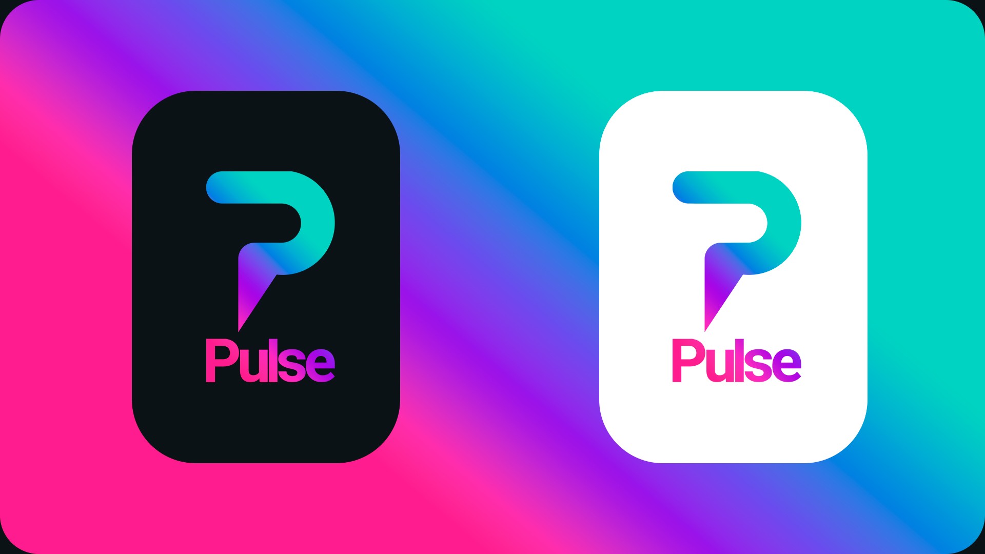
We introduced a new symbol built from a “P” and a map pin reference, representing connection and real-world meetups. The brand gradient adds warmth and energy while keeping a calm, approachable tone, making Pulse feel inviting, not “dating-first”.
Visual territory: calm tech + human warmth, driven by the Pulse gradient as a recognizable brand signature.
Tone: approachable, safe, community-led, clearly not dating-first.
System: modular design language (P + map pin symbol, shapes, components) built to scale across UI, social, motion and merch.
Hierarchy: Roboto typography with strong headline-to-body contrast for clarity in small screens and fast-scrolling environments.
The previous logo lacked distinctiveness. It didn’t communicate what Pulse stands for at first glance. The rebrand goal was to create a friendly, modern identity that instantly signals “meet friends nearby”, with a visual system strong enough to live across the app, social content and campaigns.
From neutral
to memorable.
Problem solved.
Rebrand Strategy.
The rebrand was built around clear strategic choices to make Pulse instantly recognizable and consistently usable across product and marketing. We defined a visual territory that feels friendly and modern, established a friendship tone, and created a scalable system with strong hierarchy to work from app UI to campaigns.
Decisions that
guide everything.
We introduced a new symbol built from a “P” and a map pin reference, representing connection and real-world meetups. The brand gradient adds warmth and energy while keeping a calm, approachable tone, making Pulse feel inviting, not “dating-first”.
Visual territory: calm tech + human warmth, driven by the Pulse gradient as a recognizable brand signature.
Tone: approachable, safe, community-led, clearly not dating-first.
System: modular design language (P + map pin symbol, shapes, components) built to scale across UI, social, motion and merch.
Hierarchy: Roboto typography with strong headline-to-body contrast for clarity in small screens and fast-scrolling environments.
The previous logo lacked distinctiveness. It didn’t communicate what Pulse stands for at first glance. The rebrand goal was to create a friendly, modern identity that instantly signals “meet friends nearby”, with a visual system strong enough to live across the app, social content and campaigns.
From neutral
to memorable.
Problem solved.
Rebrand Strategy.
The rebrand was built around clear strategic choices to make Pulse instantly recognizable and consistently usable across product and marketing. We defined a visual territory that feels friendly and modern, established a friendship tone, and created a scalable system with strong hierarchy to work from app UI to campaigns.
Decisions that
guide everything.
We introduced a new symbol built from a “P” and a map pin reference, representing connection and real-world meetups. The brand gradient adds warmth and energy while keeping a calm, approachable tone, making Pulse feel inviting, not “dating-first”.
Visual territory: calm tech + human warmth, driven by the Pulse gradient as a recognizable brand signature.
Tone: approachable, safe, community-led, clearly not dating-first.
System: modular design language (P + map pin symbol, shapes, components) built to scale across UI, social, motion and merch.
Hierarchy: Roboto typography with strong headline-to-body contrast for clarity in small screens and fast-scrolling environments.
The previous logo lacked distinctiveness. It didn’t communicate what Pulse stands for at first glance. The rebrand goal was to create a friendly, modern identity that instantly signals “meet friends nearby”, with a visual system strong enough to live across the app, social content and campaigns.
From neutral
to memorable.
Problem solved.
Rebrand Strategy.
The rebrand was built around clear strategic choices to make Pulse instantly recognizable and consistently usable across product and marketing. We defined a visual territory that feels friendly and modern, established a friendship tone, and created a scalable system with strong hierarchy to work from app UI to campaigns.
Decisions that
guide everything.
We introduced a new symbol built from a “P” and a map pin reference, representing connection and real-world meetups. The brand gradient adds warmth and energy while keeping a calm, approachable tone, making Pulse feel inviting, not “dating-first”.
Visual territory: calm tech + human warmth, driven by the Pulse gradient as a recognizable brand signature.
Tone: approachable, safe, community-led, clearly not dating-first.
System: modular design language (P + map pin symbol, shapes, components) built to scale across UI, social, motion and merch.
Hierarchy: Roboto typography with strong headline-to-body contrast for clarity in small screens and fast-scrolling environments.
The previous logo lacked distinctiveness. It didn’t communicate what Pulse stands for at first glance. The rebrand goal was to create a friendly, modern identity that instantly signals “meet friends nearby”, with a visual system strong enough to live across the app, social content and campaigns.
From neutral
to memorable.
Problem solved.
Rebrand Strategy.
The rebrand was built around clear strategic choices to make Pulse instantly recognizable and consistently usable across product and marketing. We defined a visual territory that feels friendly and modern, established a friendship tone, and created a scalable system with strong hierarchy to work from app UI to campaigns.
Decisions that
guide everything.
We introduced a new symbol built from a “P” and a map pin reference, representing connection and real-world meetups. The brand gradient adds warmth and energy while keeping a calm, approachable tone, making Pulse feel inviting, not “dating-first”.
Visual territory: calm tech + human warmth, driven by the Pulse gradient as a recognizable brand signature.
Tone: approachable, safe, community-led, clearly not dating-first.
System: modular design language (P + map pin symbol, shapes, components) built to scale across UI, social, motion and merch.
Hierarchy: Roboto typography with strong headline-to-body contrast for clarity in small screens and fast-scrolling environments.
The previous logo lacked distinctiveness. It didn’t communicate what Pulse stands for at first glance. The rebrand goal was to create a friendly, modern identity that instantly signals “meet friends nearby”, with a visual system strong enough to live across the app, social content and campaigns.
From neutral
to memorable.
Problem solved.
Rebrand Strategy.
The rebrand was built around clear strategic choices to make Pulse instantly recognizable and consistently usable across product and marketing. We defined a visual territory that feels friendly and modern, established a friendship tone, and created a scalable system with strong hierarchy to work from app UI to campaigns.
Decisions that
guide everything.
We introduced a new symbol built from a “P” and a map pin reference, representing connection and real-world meetups. The brand gradient adds warmth and energy while keeping a calm, approachable tone, making Pulse feel inviting, not “dating-first”.
Visual territory: calm tech + human warmth, driven by the Pulse gradient as a recognizable brand signature.
Tone: approachable, safe, community-led, clearly not dating-first.
System: modular design language (P + map pin symbol, shapes, components) built to scale across UI, social, motion and merch.
Hierarchy: Roboto typography with strong headline-to-body contrast for clarity in small screens and fast-scrolling environments.




Pulse connects people through shared interests, nearby plans and real conversations. A calm, friendly space designed to turn online discovery into real-life friendships.
Meet new friends,
naturally.
Type system for product and marketing.
Brand Typography
Pulse connects people through shared interests, nearby plans and real conversations. A calm, friendly space designed to turn online discovery into real-life friendships.
Meet new friends,
naturally.
Type system for product and marketing.
Brand Typography
Pulse connects people through shared interests, nearby plans and real conversations. A calm, friendly space designed to turn online discovery into real-life friendships.
Meet new friends,
naturally.
Type system for product and marketing.
Brand Typography
Pulse connects people through shared interests, nearby plans and real conversations. A calm, friendly space designed to turn online discovery into real-life friendships.
Meet new friends,
naturally.
Type system for product and marketing.
Brand Typography
Pulse connects people through shared interests, nearby plans and real conversations. A calm, friendly space designed to turn online discovery into real-life friendships.
Meet new friends,
naturally.
Type system for product and marketing.
Brand Typography
Pulse connects people through shared interests, nearby plans and real conversations. A calm, friendly space designed to turn online discovery into real-life friendships.
Meet new friends,
naturally.
Type system for product and marketing.
Brand Typography


ROLE
Diseñador de Marca
LOCATION
Portland, USA (Remote)
PROJECT DURATION
November 2024 – March 2025
SERVICES
Brand Strategy
Visual Identity
Logo Design
Graphic System
Art Direction
COMPANY
Pulse Now
[ABOUT]
Pulse is a social app focused on building genuine friendships through shared interests and real-life experiences. The project involved developing a new visual identity designed to convey approachability, modernity and differentiation within the highly competitive social and dating app market.
